VisionLink
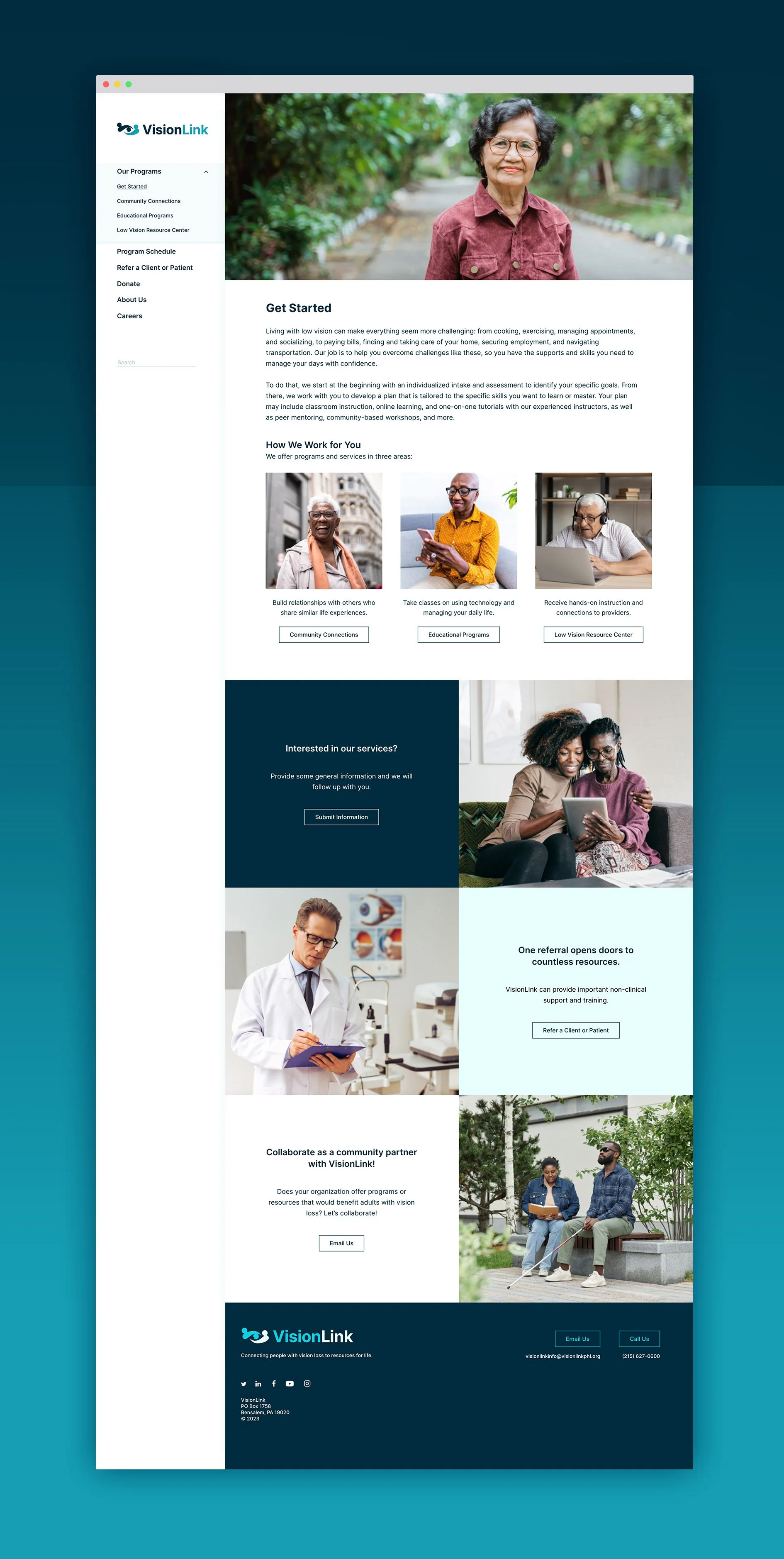
An accessible website for Philadelphia’s low-vision community
How do you communicate to low-vision audiences while still meeting the expectations of their sighted partners?
This core question drove the rebranding of VisionLink, who, after a brand audit, discovered that their branding and collateral did not meet the benchmarks of accessible design. As a company devoted to working with adults experiencing vision loss, this presented an opportunity for them to be a shining example of how design can be beautiful and functional.
Web Content Accessibility Guidelines (WCAG) influenced key decisions in the design and development of this site. Visually, these guidelines informed colors, contrast ratios, font choice, and text formatting. In development, text tagging, alt tags, ARIA labels, and form validation makes this site compatible with assistive technology.
The site design uses a persistent, left-mounted navigation menu. The main body of the site is built using a fully responsive, modular system. These modules are custom developed so that they can be easily updated by staff.
The site is fully responsive, including customized views and menus for tablet and mobile use.
VisionLinkPHL.com
SITE ORGANIZATION, DESIGN, DEVELOPMENT, AND visual REBRANDING
CLIENT: Visionlink (philadelphia)
2023
SAYGRID helped VisionLink to prioritize accessibility in all of their visual branding, by refining their logo and brand guidelines, and creating a full suite of digital and printed collateral.


