Logos
Your identity, in pixels

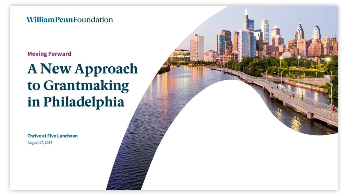
In 2024, SAYGRID redesigned the William Penn Foundation visual identity to be more readable and reflective of the Foundation’s revised approach to grantmaking. The new identity thoughtfully considers the Foundation's heritage:
The mark features a custom ligature—a nod to the recognizable signature that defined the logo for decades. It also implies joy, connectivity, and the forward-minded grantmaking of the Foundation.
Typography is driven by a grounded and modern serif font with spirited details, balanced by an extremely flexible and accessible sans serif font.
Color is inspired by the work of Phoebe Waterman Haas and is centered on a blue value that is at home in the foundation space.

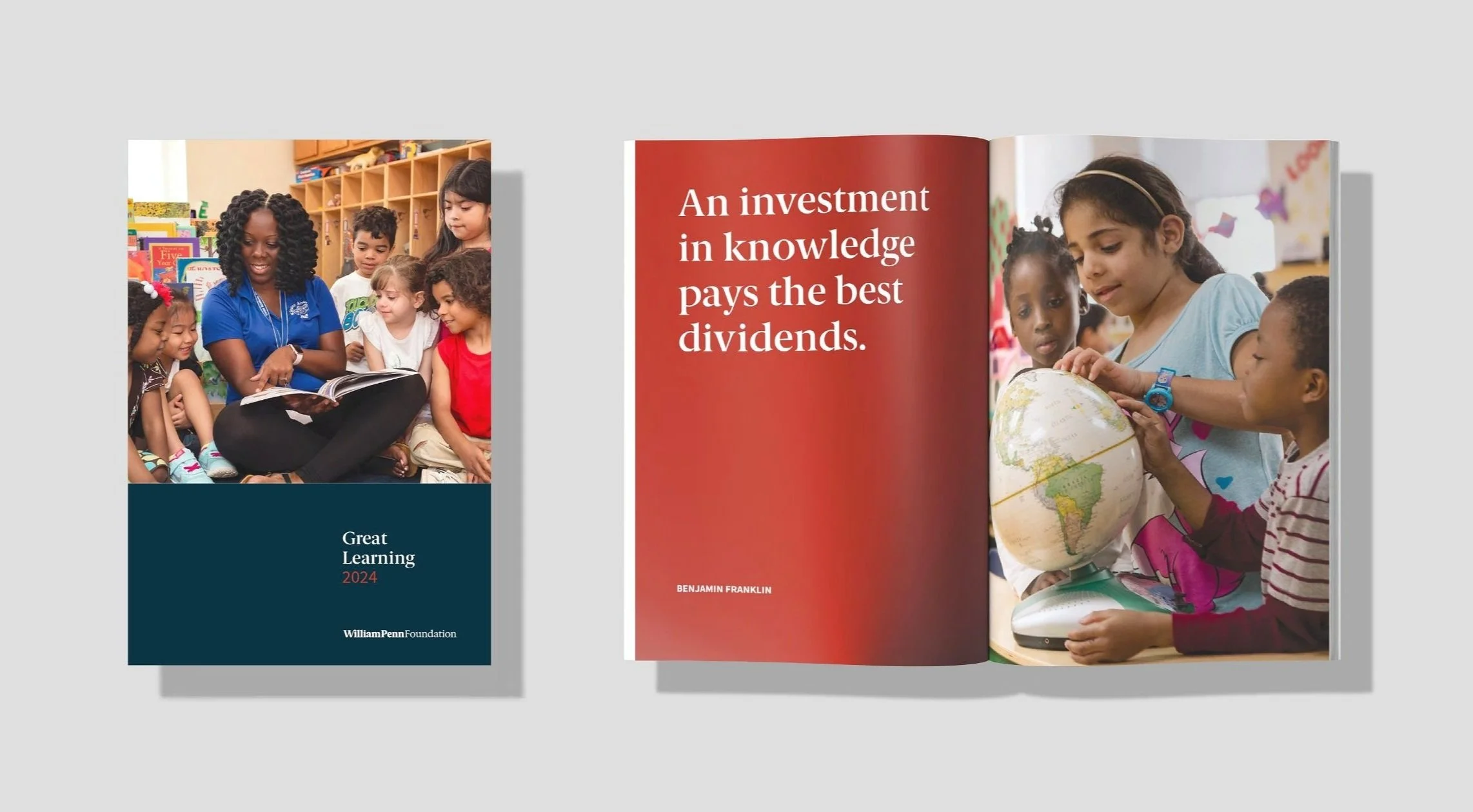
Photo courtesy The William Penn Foundation
Founded by Otto and Phoebe Haas in 1945, the Foundation was originally named the Phoebe Waterman Foundation. A reference to the Haas family and heritage was a core goal of the Foundation’s new visual identity, and the work of Phoebe Waterman Haas provided rich grounds for inspiration in the development of colors.
Phoebe Waterman was one of the first women to earn a Ph.D. in astronomy. Among her contributions to the field was her study of spectroscopy, classifying stars by their spectra, or colors. The approach to colors that define the visual identity is inspired by subtle spectral shifts, as well as saturated, sophisticated tones that are well-suited to dark and light backgrounds alike. These five colors are used to identify and support the five individual practice areas of the Foundation.


The visual identity was created in partnership with the supremely talented David P.L. Jones, a longtime collaborator with SAYGRID.

Winner of a Graphis 2024 Silver Design Award
Kouvenda Media is an independent podcast media company with a dual focus on original investigative podcast journalism and podcast production. Their visual identity is composed of two detachable elements: an owl, with its form based on principles of sacred geometry; and the logotype, formed of modern, open letterforms. A palette of electric blue tones exploits the color gamut of a brand working primarily in a digital color space. The logo was created in partnership with David P.L. Jones.


Podcasts produced by Kouvenda Media consistently apply the owl to podcast artwork as an indicia that brands their work. See more at KouvendaMedia.com.


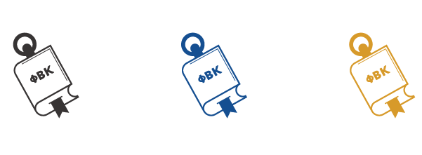
The Phi Beta Kappa Society (PBK), founded in 1776, is an academic honor society with more than half a million members worldwide. Established in the 1950s, The PBK Book Awards are given annually to outstanding scholarly books published in the United States. A familiar and recognizable icon for PBK members is a tilted golden key, which informed the design of the book awards logo. The new branding includes alternate lock-ups and a set of accompanying “micro marks” for use in social media and small applications.
In Motion, In Place: Trisha Brown Dance Company in Fairmount Park was a series of three free public performances by this world-renowned company, brought to Philadelphia by Fairmount Park Conservancy. Performances were held on building roofs along Benjamin Franklin Parkway, atop rafts on the East Park Reservoir, and at Mount Pleasant Mansion. For the logo design that would brand all event-related collateral (like bus shelters and banners), I found inspiration in an aesthetic of austerity and of calculated movement. Strict, angular letterforms for “I” and “N" are rigidly aligned and layered; the whole form is then leaned, creating depth, connecting and dividing spaces, vibrating, and moving with restraint.

The Interdisciplinary Sexuality Research Collaborative (ISRC) at Widener University’s Center for Human Sexuality Studies is a dynamic and inclusive organization that produces and promotes sexuality research. The icon uses layered facets to represent multi-disciplinary academia in a shared environment, creating a dimensional form with depth, complexity, and perspective. The large triangle emerging out of the smaller facets indicates progress.

The full logo set includes a number of variations, including vertical and one-color arrangements for a wide range of applications.
The Mantua Greenway is a walking and biking trail that weaves through Philadelphia’s Mantua neighborhood, which aims to connect the West Bank Schuylkill River trail with Centennial Commons in West Fairmount Park, and provide gathering spaces for its devoted community. The form is evocative of a tulip—an homage to the visionary Mantua resident Ms. Bessie Washington, who planted a colorful garden on Mantua Avenue in 2011. An “M” form emerges from the top of the logo as a reference to Mantua. For those familiar with the geographical footprint of Mantua, the form of the neighborhood can also be discerned. This logo was part of SAYGRID’s work to design the Mantua Greenway website.
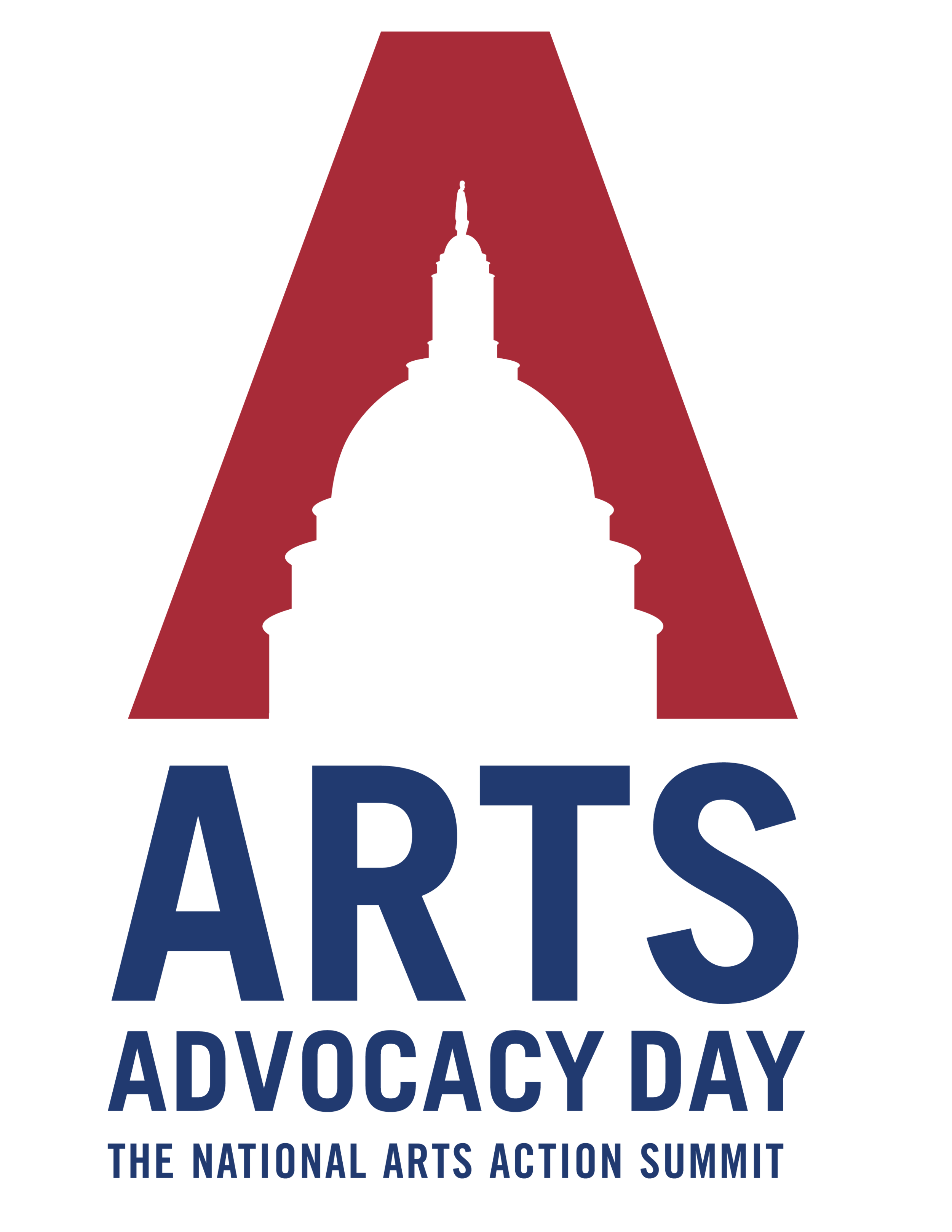
The National Arts Action Summit (NAAS), an annual, multi-day event organized by Americans for the Arts, brings together arts advocates from across the country. As part of NAAS, Arts Advocacy Day provides hands-on advocacy training to learn the latest research and legislative arts priorities from the experts. I created this logo in 2015, which is used in all Arts Advocacy Day collateral, including the attendee handbook, which alternates colors from blue to red each year.


A simple logo system for the inaugural Urban Innovation Summit hosted by Drexel University’s Lindy Institute for Urban Innovation, which reflects the Summit’s two main events . Using a palette that coordinates directly with Drexel University’s branding, the mark is designed to be disassembled for the individual events, or used together.


Designed for Regional Housing Legal Service’s (RHLS) 40th anniversary in 2013, this mark leverages the concept of building blocks to assemble typographic forms.

